Unified Dynamic Annotation Visualizer
UDAV is designed to enable different disciplines to display their automatic pre-processing results in a schema-based and reproducible, dynamic and interactive way without the need to hard-code manual and user-defined visualizations for each new project.
Features
- Dynamic and interactive charts
- Visual editor
- Different export options: svg, png, csv, json
Widgets
UDAV currently contains the following widgets:
- Text (static)
- Image (static)
- Video (static)
- Inline Frame (static)
- Table
- Bar Chart
- Pie Chart
- Line Chart
- Highlight Text
- Simple Map
- Network Graph
Demo
You can find a demo here where you can play around a little.
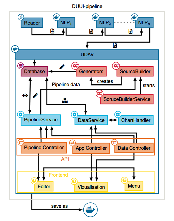
Architecture
The architecture of UDAV includes a backend and frontend component that can interact with each other via an API layer, both instantiated within a Docker image. Nevertheless, it can be used on any system, as all system components are encapsulated in a Docker container. Importing data is performed using a standardized procedure as part of an existing DUUI pipeline. This involves a set of documents being read by the reader and auto- matically pre-processed by a set of NLP processes through a pipeline. At the end of this pipeline is a Java-based component that serves as an importer for UDAV and ingests all annotated documents into the integrated database.
Getting Started
Requirements
- Docker and Docker Compose (v2.x or later)
Quick Start (Docker Compose)
-
Clone the repository:
git clone https://github.com/texttechnologylab/Unified-Dynamic-Annotation-Visualizer.git cd Unified-Dynamic-Annotation-Visualizer -
Create your
.envfile by copying the provided example:cp .env.example .env -
Start the application:
docker compose up -dThis starts PostgreSQL and the UDAV application. The web UI is available at http://localhost:8080 once the container is healthy (usually within ~30–60 seconds).
Note: If you’re looking for a small demo without any setup, check our open demo.
Importing DUUI Annotation Data
For the full configuration reference, see DUUI Importer — Configuration Reference.
To import XMI/GZ annotation files produced by DUUI pipelines, you need to configure the importer in your .env before starting the containers.
Important:
DUUI_IMPORTER_PATHandDUUI_IMPORTER_TYPE_SYSTEM_PATHmust be absolute paths on your host machine — Docker Compose mounts them into the container automatically.
1. Set the path to your annotation files:
DUUI_IMPORTER_PATH=/absolute/path/to/your/xmi/files
2. Set the file extension matching your corpus (.xmi for uncompressed, .gz for gzip-compressed):
DUUI_IMPORTER_FILE_ENDING=.xmi
# or
DUUI_IMPORTER_FILE_ENDING=.gz
3. (Optional) Set the path to an external TypeSystem XML if you want to use a custom type system instead of letting UDAV auto-detect it from the XMI files:
DUUI_IMPORTER_TYPE_SYSTEM_PATH=/absolute/path/to/your/typesystem
Note: If
DUUI_IMPORTER_TYPE_SYSTEM_PATHis left empty, the type system is auto-detected from the XMI files. If you set it, point it to the folder containing your TypeSystem XML file.
4. Enable the importer and start:
DUUI_IMPORTER=true
docker compose up -d
The importer runs on startup and processes all matching files in the configured directory. Import progress is logged and visible via:
docker compose logs -f udav
Example .env for DUUI import
# Database
DB_USER=postgres
DB_PASS=postgres
POSTGRES_DB=udav

# DUUI Importer
DUUI_IMPORTER=true
DUUI_IMPORTER_PATH=/data/my-corpus/xmi-files
DUUI_IMPORTER_FILE_ENDING=.gz
DUUI_IMPORTER_WORKERS=4
DUUI_IMPORTER_CAS_POOL_SIZE=12
DUUI_IMPORTER_TYPE_SYSTEM_PATH=

# Java memory (adjust to your system)
JAVA_OPTS=-Xmx10G -Xms1024m
Source Build and Generators
To visualize annotations from imported UIMA documents subject to user requirements, UDAV implements a Data Generation Layer with two modules:
SourceBuilderinterprets pipeline configurations and instantiates generators for each visualization.- Generators transform, aggregate, and structure annotations to meet the requirements of the API and underlying visualizations (according to the pipeline definition). That is, each diagram or visualization type with distinct data requirements is produced by a dedicated generator. To support new data structures, developers need to implement the standard
Generatorinterface with custom logic.
Data API
UDAV provides a RESTful API for fetching the data to be visualized on the frontend. The API is built using Java and Spring Boot, and it interacts with the integrated database to retrieve the necessary data based on the user’s requests. The API endpoints are designed to support various types of queries, allowing for flexible data retrieval that can be easily consumed by the frontend components. The API is constructed in a modular way. With Controller, Service and Repository layers, it follows the common best practices for building maintainable and scalable APIs. The Controller layer handles incoming HTTP requests and maps them to the appropriate Service methods. The Service layer contains the business logic for processing the requests and interacting with the Repository layer, which is responsible for database operations. This makes it easy to extend the API with new endpoints or modify existing ones as needed, without affecting other parts of the application. The API also includes error handling and validation to ensure that requests are processed correctly and that any issues are communicated back to the client in a clear and consistent manner.
The only exception is the data API, which uses a custom ChartHandler to support different types of charts in a modular way. Each chart type has its own handler.
Webpage
The frontend uses Freemarker to render the html templates, d3.js for some of the visualization components, gridstack.js for the draggable grid in the editor, Floating UI for some UI components and Bootstrap for icons and styling.
Structure
The frontend is located in the resources folder of the Java project. This directory contains all static assets and server-rendered templates, following a clear separation between static resources and template logic.
The static directory includes stylesheets, images, and JavaScript logic, while templates contains the FreeMarker templates used to render the HTML pages. Both directories are structured into pages and shared subdirectories: pages contains page-specific content for each page of the application, while shared provides reusable code and resources used across multiple pages. The api directory holds the api communication and the widgets directory contains the available widgets divided into charts and static widgets.
Global CSS variables are defined in variables.css. The widgets are registered in the widgets.js file. The packages directory contains third-party dependencies.
Overview of the folder structure:
📁 resources
├─ 📁 static
│  ├─ 📁 css
│  │  ├─ 📁 pages
│  │  ├─ 📁 shared
│  │  └─ 📄 variables.css
│  ├─ 📁 data
│  ├─ 📁 img
│  ├─ 📁 js
│  │  ├─ 📁 api
│  │  ├─ 📁 pages
│  │  │  ├─ 📁 editor
│  │  │  │  ├─ 📁 configs
│  │  │  │  ├─ 📁 controller
│  │  │  │  ├─ 📁 utils
│  │  │  │  ├─ 📄 Editor.js
│  │  │  ├─ 📁 index
│  │  │  └─ 📁 view
│  │  │     ├─ 📁 filter
│  │  │     ├─ 📁 toolbar
│  │  │     ├─ 📁 utils
│  │  │     └─ 📄 View.js
│  │  ├─ 📁 shared
│  │  │  ├─ 📁 classes
│  │  │  └─ 📁 modules
│  │  ├─ 📁 widgets
│  │  │  ├─ 📁 charts
│  │  │  ├─ 📁 static
│  │  │  ├─ 📄 D3Visualization.js
│  │  │  ├─ 📄 WidgetInterface.js
│  │  │  └─ 📄 widgets.js
│  ├─ 📁 packages
│  └─ 📄 favicon.ico
└─ 📁 templates
   ├─ 📁 error
   ├─ 📁 pages
   │  ├─ 📁 editor
   │  │  ├─ 📄 editor.ftl
   │  │  ├─ 📄 editorGrid.ftl
   │  │  └─ 📄 editorSidebar.ftl
   │  ├─ 📁 index
   │  └─ 📁 view
   └─ 📁 shared
Tutorials
If you want to change the primary color of the application or other general properties you can simply change them in the variables.css file.
Below are some instructions for adding new components to the webpage.
Adding a new chart widget
To add a new chart widget, follow these steps:
-
Create a new JavaScript class in the
widgets/chartsfolder. This class will define the widget’s configuration and rendering. - Define the defaultConfig object. This is the initial configuration for the widget after creation. Include:
- title: The display title of the chart.
- type: The chart’s type (must match the class name).
- generator: Will be set by the user later.
- options: Chart-specific options.
- icon: The icon will be displayed in the editor.
- w: The initial width of the widget in grid cells.
- h: The initial height of the widget in grid cells.
- Define the formConfig object. This configures the modal form where users can edit the chart’s settings. Use the property paths in defaultConfig for the keys. Each field requires:
- type: The input type (see
inputFactories.jsfor available types). - label: The label displayed to the user.
- options (optional): Additional configuration for the input.
- type: The input type (see
- Extend the
WidgetInterfaceclass and implement ainitand arendermethod.- The init method will be called once after creation of the widget and should contain the first data fetch and rendering as well as the configuration of the controls.
- The render method will be called every time the chart data changes, for example after a filter is applied.
-
If your new widget uses d3.js to create an svg, you can extend the
D3Visualizationclass instead. This class already provides helpful functions for svg initialization and resizing, tooltips or axis creation. -
You can use this template as a starting point:
export default class NewChart extends WidgetInterface { static defaultConfig = { type: "NewChart", title: "New Chart", generator: { id: "" }, options: {}, icon: "bi bi-chart", w: 6, h: 6, }; static formConfig = { title: { type: "text", label: "Title", }, "generator.id": { type: "select", label: "Generator", options: () => getGeneratorOptions("CategoryNumber"), }, }; constructor(root, config) { super(root, config); } clear() { // Clear and set-up chart inside chart area } init() { const { data, meta } = await this.fetch(); this.render(data[0]); // Initialize export options this.exports.init(meta.total > 1); this.filter = { // Initialize filter }; // Add controls ... } render(data) { this.clear(); // Render chart data ... this.data = data; } } -
Finally, register the new widget by adding it to the
widgets.jsfile so it’s available in the editor:export default { BarChart, LineChart, // ... NewChart, };
Adding a new generator
To add a new generator, follow these steps:
-
Create a new JavaScript class in the
configsfolder of the editor page. This class will define the generator’s configuration. -
Define the generator’s token. The token is a short string that will be displayed as an icon in the editor.
- Define the defaultConfig object. This is the initial configuration for the generator after creation. Include:
- name: The display name of the generator.
- type: The generator’s type (must match the class name).
- settings: Generator-specific settings.
- extends: An array of other generators this one extends (optional).
- Define the formConfig object. This configures the modal form where users can edit the generator’s settings. Use the property paths in defaultConfig for the keys. Each field requires:
- type: The input type (see
inputFactories.jsfor available types). - label: The label displayed to the user.
- options (optional): Additional configuration for the input.
- type: The input type (see
-
You can use this template as a starting point:
export default class NewGenerator { static token = "NG"; static defaultConfig = { name: "New Generator", type: "NewGenerator", settings: {}, extends: [], }; static formConfig = { name: { type: "text", label: "Name", }, extends: { type: "multiselect", label: "Extends (optional)", options: () => getGeneratorOptions("NewGenerator"), }, }; } -
Finally, register the new generator by adding it to the
configs.jsfile so it’s available in the editor:export default { TextFormatting, CategoryNumber, // ... NewGenerator, };
Formular configuration
The widget controls and option modals in the editor are defined through a JSON structure. This structure is used by the ControlsHandler for widgets, as well as by the formConfig parameter of widgets, source and generator configurations. It defines the form input fields, including their types, labels, and available options.
Available input types are implemented in inputFactories.js, which acts as a central registry for creating the form inputs. If additional input types are needed, they can be easily extended by adding new implementations to inputFactories.js.
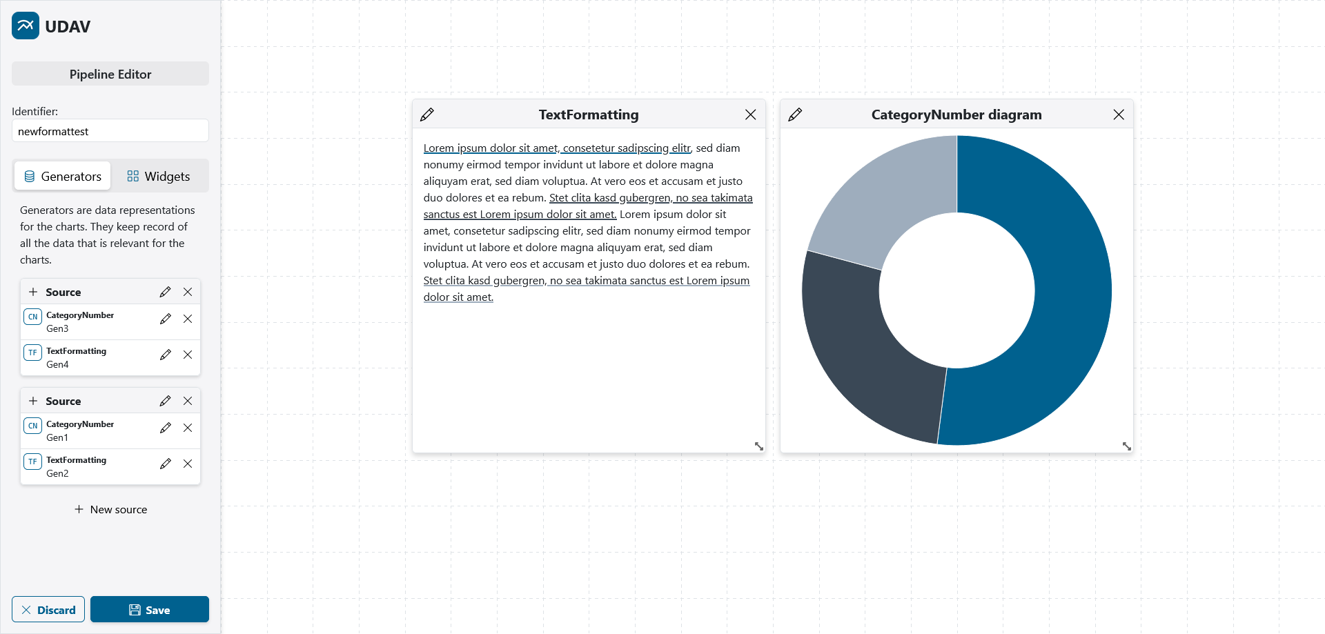
Screenshots
 |
|---|
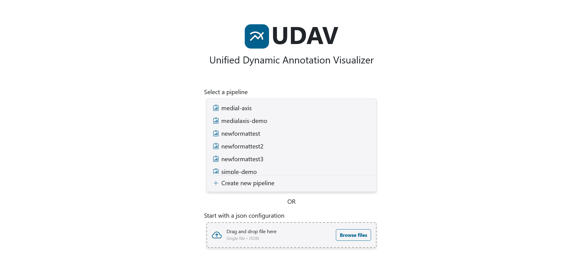
| The main menu in UDAV for selecting and managing different pipeline views. |
 |
|---|
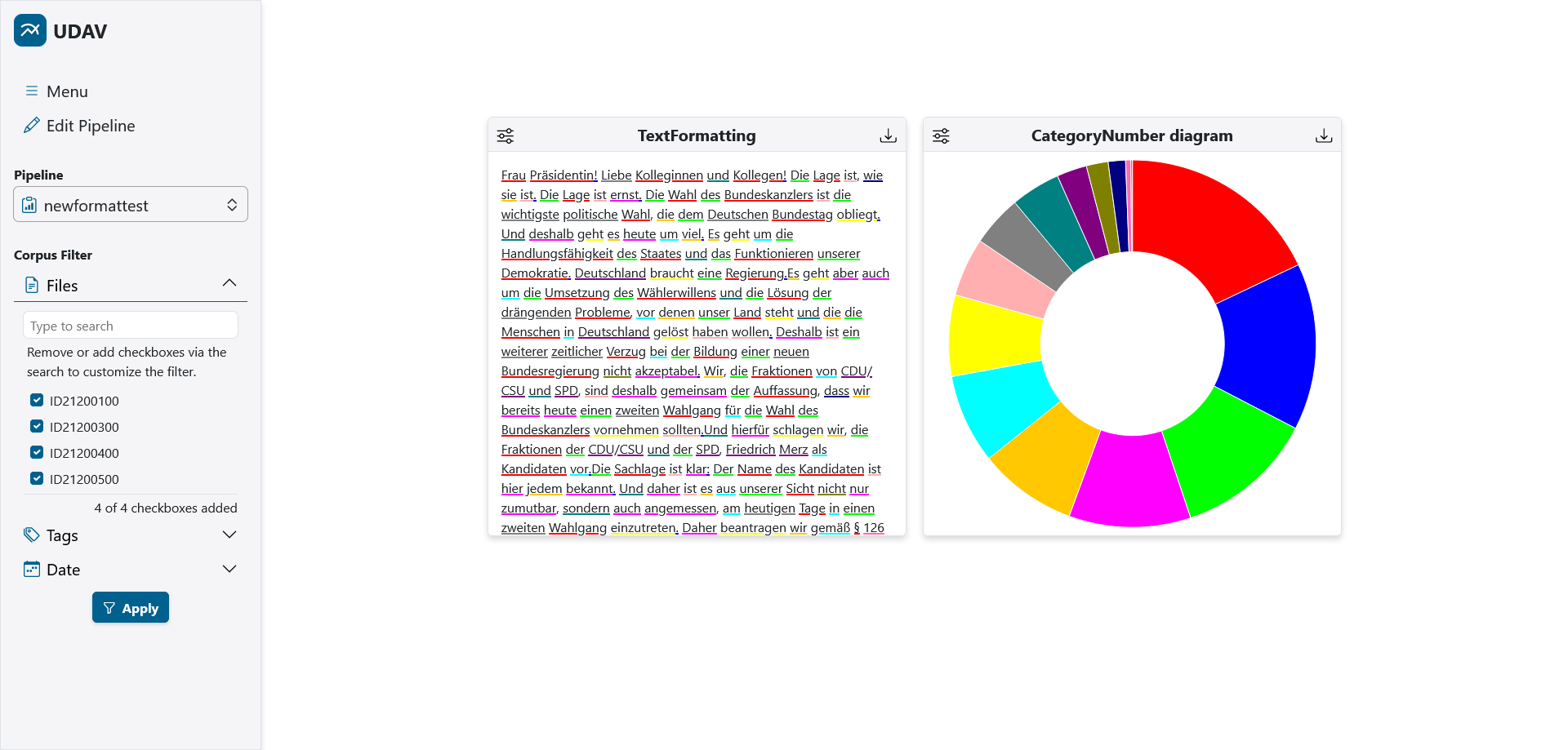
| This pipeline view shows diagrams with annotations for part-of-speech. Filters can be set at the corpus level in the sidebar on the left. |
 |
|---|
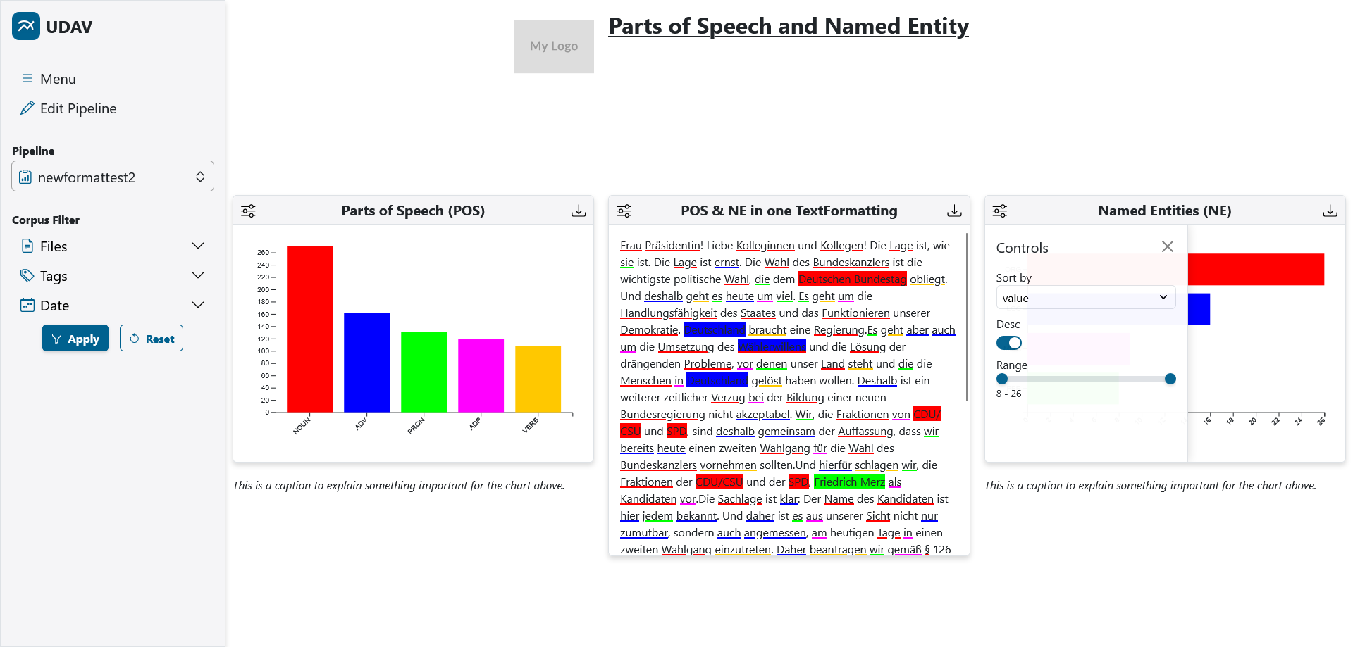
| This pipeline view provides some diagrams with annotations for part-of-speech and named entities as well as static text and image to provide a title (top) and captions below each diagram. In the middle, a text selected via UDAV is visualized, where the highlighting corresponds to the colors of the other diagrams due to a shared Generator. The control panel for filtering the displayed data of the bar chart on the right is opened. |
 |
|---|
| Example of the Editor in UDAV for creating and modifying Pipelines as well as for arranging the resulting widgets. The sources and generators can be modified in the sidebar on the left. |
Authors / Contributors
- Thiemo Dahmann

- Julian Schneider

- Philipp Stephan
- Giuseppe Abrami (Supervision)
- Prof. Dr. Alexander Mehler (Supervision)
Publications
Here we list all publications related to UDAV, which you can also refer to when citing UDAV in your work:
@inproceedings{Dahmann:et:al:2026,
  title = {Towards the Generation and Application of Dynamic Web-Based Visualization of UIMA-based Annotations for Big-Data Corpora with the Help of Unified Dynamic Annotation Visualizer},
  booktitle = {Proceedings of the Fifteenth Language Resources and Evaluation Conference (LREC 2026)},
  year      = {2026},
  pages = {6695--6705},
  author    = {Dahmann, Thiemo and Schneider, Julian and Stephan, Philipp and Abrami, Giuseppe
               and Mehler, Alexander},
  address = {Palma, Mallorca, Spain},
  publisher = {European Language Resources Association (ELRA)},
  editor = {Piperidis, Stelios and Bel, Núria and van den Heuvel, Henk and Ide, Nancy and Krek, Simon and Toral, Antonio},
  doi = {10.63317/5ce2aaity4yz},
  keywords  = {NLP, UIMA, Annotations, dynamic visualization, uce},
  abstract = {The automatic and manual annotation of unstructured corpora is a routine task in many scientific fields and is supported by a variety of existing software solutions. Despite this variety, few solutions currently support annotation visualization, especially for dynamic generation and interaction. To bridge this gap and visualize annotated corpora based on user-, project-, or corpus-specific aspects, we developed Unified Dynamic Annotation Visualizer (UDAV). UDAV is a web-based solution that implements features not supported by comparable tools, enabling a customizable and extensible toolbox for interacting with annotations and allowing integration into existing big-data frameworks. We exemplify UDAV through a range of visualizations and also provide an evaluation of corpus import and processing performance.},
  pdf = {http://www.lrec-conf.org/proceedings/lrec2026/pdf/2026.lrec2026-1.533.pdf}
}
License
This project is published under the AGPL-3.0 license.